
Data Visualization & Reporting Tools
These are the specialized categories within Data Visualization & Reporting Tools. Looking for something broader? See all Business Intelligence & Analytics Software categories.

How big is your team?
What's your budget situation?
What's your team's technical comfort level?
What's the ONE thing this tool must do well?

Power BI is a powerful data visualization tool designed to help operation teams transform data into meaningful insights. Its advanced data-analysis tools, AI capabilities, and intuitive report creation tool make it ideal for real-time dashboard creation, addressing the need for instant information accessibility and data-driven decision-making in this industry.
Best for Real Time Dashboard Tools for Operations Teams
Expert Take
Power BI stands out as a leading tool in real-time dashboard creation for operations teams due to its advanced data analysis capabilities and AI features. It offers strong market credibility with numerous integrations and a user-friendly interface, although it requires a learning curve for new users.
Pros
- Used by 97% of Fortune 500 companies
- Enterprise-grade security (HIPAA/FedRAMP)
- Advanced AI Copilot features included
- Leader in Gartner Magic Quadrant (18 years)
Cons
- No native desktop app for Mac OS
- Steep learning curve for DAX language
- Complex licensing structure (Fabric vs Pro)
- Price increase effective April 2025
Best for teams that are
- Excel power users working deeply within the Microsoft ecosystem.
- Teams needing robust SQL-based data visualization and modeling.
Skip if
- Mac users wanting a native, locally installed desktop app [cite: 24].
- Organizations relying heavily on NoSQL databases like MongoDB [cite: 24].
Best for teams that are
- Excel power users working deeply within the Microsoft ecosystem.
- Teams needing robust SQL-based data visualization and modeling.
Skip if
- Mac users wanting a native, locally installed desktop app [cite: 24].
- Organizations relying heavily on NoSQL databases like MongoDB [cite: 24].
Pros
- Used by 97% of Fortune 500 companies
- Seamless integration with Excel and Teams
- Enterprise-grade security (HIPAA/FedRAMP)
- Advanced AI Copilot features included
- Leader in Gartner Magic Quadrant (18 years)
Cons
- No native desktop app for Mac OS
- Steep learning curve for DAX language
- Performance issues with very large datasets
- Complex licensing structure (Fabric vs Pro)
- Price increase effective April 2025
Expert Take
Power BI stands out as a leading tool in real-time dashboard creation for operations teams due to its advanced data analysis capabilities and AI features. It offers strong market credibility with numerous integrations and a user-friendly interface, although it requires a learning curve for new users.

Workday Adaptive Planning is an exceptional SaaS solution for financial reporting and FP&A dashboards. The software was chosen for its real-time financial analytics capabilities that allow businesses to make faster, more informed decisions. The easy-to-use dashboards and clear visualizations are tailored to the specific needs of executive and board reporting, ensuring efficient and effective communication of financial data.
Best for Dashboard Tools for Executive and Board Reporting
Expert Take
Workday Adaptive Planning excels in providing real-time financial analytics and user-friendly dashboards tailored for executive and board reporting. Its market credibility is supported by third-party recognition, and it offers robust integration capabilities. While pricing transparency could be improved, the product remains a top choice for financial planning and analysis.
Pros
- Leader in Gartner Magic Quadrant (4x)
- Agnostic integration with 300+ external systems
- AI-driven anomaly detection and forecasting
- Comprehensive security (SOC 1-3, ISO 27001)
Cons
- Steep learning curve for administrators
- Complex implementation process
- Performance lags with massive datasets
- Reporting tools can be rigid
Best for teams that are
- Organizations needing robust scenario planning within the Workday ecosystem
- Finance leaders needing real-time collaboration on workforce and expense planning
Skip if
- Small businesses with limited budgets and simple planning needs
- Non-finance users needing simple KPI tracking without steep learning curves
Best for teams that are
- Organizations needing robust scenario planning within the Workday ecosystem
- Finance leaders needing real-time collaboration on workforce and expense planning
Skip if
- Small businesses with limited budgets and simple planning needs
- Non-finance users needing simple KPI tracking without steep learning curves
Pros
- Elastic Hypercube Technology scales compute power
- Leader in Gartner Magic Quadrant (4x)
- Agnostic integration with 300+ external systems
- AI-driven anomaly detection and forecasting
- Comprehensive security (SOC 1-3, ISO 27001)
Cons
- Steep learning curve for administrators
- Pricing is opaque and high-end
- Complex implementation process
- Performance lags with massive datasets
- Reporting tools can be rigid
Expert Take
Workday Adaptive Planning excels in providing real-time financial analytics and user-friendly dashboards tailored for executive and board reporting. Its market credibility is supported by third-party recognition, and it offers robust integration capabilities. While pricing transparency could be improved, the product remains a top choice for financial planning and analysis.

EdrawMax empowers business users with its extensive suite of 280+ diagram types, offering seamless cross-platform support. Ideal for technical teams, it combines intuitive drag-and-drop features with advanced generative AI tools for effortless flowchart creation.
Best for Self Service Dashboard Tools for Business Users
Expert Take
EdrawMax stands out as an incredibly versatile diagramming powerhouse that bridges the gap between simple charting tools and complex engineering software. We love its unmatched breadth of 280+ diagram types and cross-platform native support—especially for Linux—which makes it accessible to almost any technical team. The recent additions of generative AI tools for one-click flowchart creation further cement it as a modern, high-value alternative to legacy enterprise solutions.
Pros
- Massive template and symbol library
- Intuitive drag-and-drop interface
- Highly affordable Visio alternative
Cons
- Confusing pricing plans and AI tokens
- Free version watermarks all exports
- Support unresponsive regarding billing issues
Best for teams that are
- Users needing templates for flowcharts and mind maps.
- Teams wanting an affordable alternative to MS Visio.
Skip if
- Users needing sophisticated CAD-level tech drawing.
- Teams needing automated data analytics dashboards.
Best for teams that are
- Users needing templates for flowcharts and mind maps.
- Teams wanting an affordable alternative to MS Visio.
Skip if
- Users needing sophisticated CAD-level tech drawing.
- Teams needing automated data analytics dashboards.
Pros
- Massive template and symbol library
- Native Linux, Mac, and Windows support
- Intuitive drag-and-drop interface
- Highly affordable Visio alternative
Cons
- Confusing pricing plans and AI tokens
- Free version watermarks all exports
- Occasional shape manipulation difficulties
- Support unresponsive regarding billing issues
Expert Take
EdrawMax stands out as an incredibly versatile diagramming powerhouse that bridges the gap between simple charting tools and complex engineering software. We love its unmatched breadth of 280+ diagram types and cross-platform native support—especially for Linux—which makes it accessible to almost any technical team. The recent additions of generative AI tools for one-click flowchart creation further cement it as a modern, high-value alternative to legacy enterprise solutions.
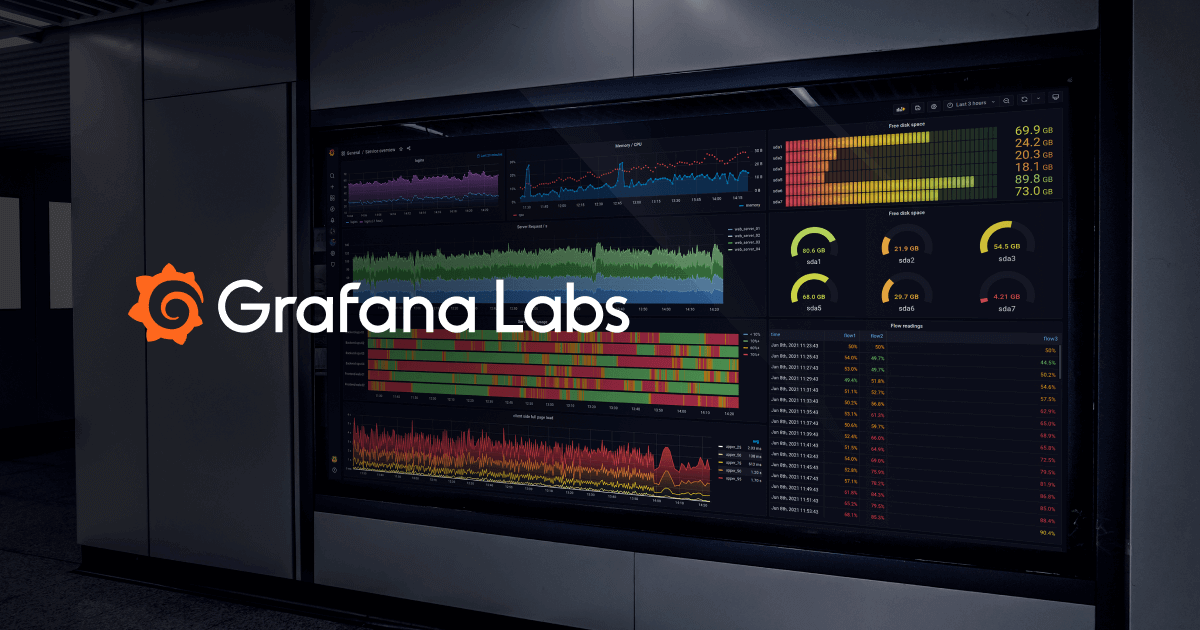
Grafana is a powerful open-source platform specifically designed for operations teams. It provides real-time dashboard tools that enable users to create alerts, manage on-call schedules, and learn from postmortems. Its flexible and composable nature allows it to address the dynamic needs of the industry, providing critical insights into business operations.
Best for Real Time Dashboard Tools for Operations Teams
Expert Take
Grafana excels as a real-time dashboard tool for operations teams, offering robust capabilities in data visualization and incident response. Its open-source nature and multi-datasource support enhance its flexibility and adaptability, making it a preferred choice for technical teams. While setup complexity and technical expertise requirements are noted, its comprehensive feature set and community-driven improvements solidify its position as a leading observability platform.
Pros
- Massive ecosystem with 150+ data source plugins
- Generous 'forever free' cloud tier
- Vendor-neutral 'big tent' data philosophy
- Highly customizable and flexible dashboards
Cons
- Steep learning curve for PromQL and LogQL
- High cardinality can cause frontend performance issues
- Enterprise pricing requires $25k minimum commitment
- Self-hosting requires significant operational effort
Best for teams that are
- DevOps and IT ops teams monitoring time-series telemetry data.
- Organizations needing deep integration with Prometheus or k8s.
Skip if
- Non-technical users lacking SQL or query language skills [cite: 23].
- Teams seeking advanced automated incident remediation workflows [cite: 21].
Best for teams that are
- DevOps and IT ops teams monitoring time-series telemetry data.
- Organizations needing deep integration with Prometheus or k8s.
Skip if
- Non-technical users lacking SQL or query language skills [cite: 23].
- Teams seeking advanced automated incident remediation workflows [cite: 21].
Pros
- Unified visualization for metrics, logs, and traces
- Massive ecosystem with 150+ data source plugins
- Generous 'forever free' cloud tier
- Vendor-neutral 'big tent' data philosophy
- Highly customizable and flexible dashboards
Cons
- Steep learning curve for PromQL and LogQL
- SSO and RBAC gated behind Enterprise plans
- High cardinality can cause frontend performance issues
- Enterprise pricing requires $25k minimum commitment
- Self-hosting requires significant operational effort
Expert Take
Grafana excels as a real-time dashboard tool for operations teams, offering robust capabilities in data visualization and incident response. Its open-source nature and multi-datasource support enhance its flexibility and adaptability, making it a preferred choice for technical teams. While setup complexity and technical expertise requirements are noted, its comprehensive feature set and community-driven improvements solidify its position as a leading observability platform.

Tableau is a powerful data visualization and analytics software specifically designed for financial reporting. Its advanced AI/ML capabilities, along with robust governance and visual storytelling, make it an ideal tool for industry professionals who need to make data-driven decisions and present complex financial data in an easily understandable format.
Best for Data Visualization Tools for Financial Reporting
Expert Take
Tableau is recognized for its advanced data visualization capabilities and AI/ML integration, making it a leader in financial reporting tools. Its robust governance and visual storytelling features are well-documented, supporting its premium positioning in the market.
Pros
- Industry-leading visual analytics capabilities
- HIPAA, SOC 2, and ISO compliant
- Extensive library of native data connectors
- Supports Python and R for advanced analytics
Cons
- High cost for Creator licenses ($75/mo)
- Performance lags with massive datasets
- Expensive Data Management add-ons
- Complex server administration for on-prem
Best for teams that are
- Analysts needing highly interactive, customizable dashboards.
- Organizations wanting deep, flexible exploratory data analysis.
Skip if
- Teams wanting quick, out-of-the-box reporting without analysts.
- Budget-conscious users, as total cost of ownership is high.
Best for teams that are
- Analysts needing highly interactive, customizable dashboards.
- Organizations wanting deep, flexible exploratory data analysis.
Skip if
- Teams wanting quick, out-of-the-box reporting without analysts.
- Budget-conscious users, as total cost of ownership is high.
Pros
- Industry-leading visual analytics capabilities
- Deep integration with Salesforce ecosystem
- HIPAA, SOC 2, and ISO compliant
- Extensive library of native data connectors
- Supports Python and R for advanced analytics
Cons
- High cost for Creator licenses ($75/mo)
- Performance lags with massive datasets
- Steep learning curve for advanced features
- Expensive Data Management add-ons
- Complex server administration for on-prem
Expert Take
Tableau is recognized for its advanced data visualization capabilities and AI/ML integration, making it a leader in financial reporting tools. Its robust governance and visual storytelling features are well-documented, supporting its premium positioning in the market.

Lucia is an AI-driven board reporting software by Board Intelligence tailored specifically for executives and board members. It simplifies the complex process of crafting concise, impactful board and management reports, addressing the industry's need for efficient and effective reporting tools.
Best for Dashboard Tools for Executive and Board Reporting
Expert Take
Board Intelligence Lucia stands out in the executive and board reporting space due to its AI-driven capabilities, which streamline report creation and enhance decision-making processes. Its focus on executive needs and efficient reporting makes it a top contender in its category.
Pros
- Biometric login (FaceID/TouchID) supported
- ISO 27001 & UK Gov approved security
- 24/7 human support (no chatbots)
- Private AI instances ensure data privacy
Cons
- High platform and setup fees
- Occasional document upload glitches
- Premium pricing excludes smaller orgs
- Learning curve for admin features
Best for teams that are
- Teams wanting AI assistance to write concise, impact-focused summaries
- Organizations aiming to standardize report structures across departments
Skip if
- Users seeking a primary tool for quantitative data visualization
- Those looking for real-time operational dashboards rather than written reports
Best for teams that are
- Teams wanting AI assistance to write concise, impact-focused summaries
- Organizations aiming to standardize report structures across departments
Skip if
- Users seeking a primary tool for quantitative data visualization
- Those looking for real-time operational dashboards rather than written reports
Pros
- AI coaches writers on strategic depth
- Biometric login (FaceID/TouchID) supported
- ISO 27001 & UK Gov approved security
- 24/7 human support (no chatbots)
- Private AI instances ensure data privacy
Cons
- High platform and setup fees
- Limited agenda customization options
- Occasional document upload glitches
- Premium pricing excludes smaller orgs
- Learning curve for admin features
Expert Take
Board Intelligence Lucia stands out in the executive and board reporting space due to its AI-driven capabilities, which streamline report creation and enhance decision-making processes. Its focus on executive needs and efficient reporting makes it a top contender in its category.

Govenda is a robust SaaS solution designed to simplify board and executive reporting. Its real-time dashboards and reports provide administrators with vital information to make strategic decisions. It is tailored to meet the needs of executives and board members, eliminating the need to manually track and compile data.
Best for Dashboard Tools for Executive and Board Reporting
Expert Take
Govenda excels in providing real-time, secure, and user-friendly dashboards tailored for executive and board reporting. Its robust analytics capabilities and premium security features make it a top choice for enterprises needing strategic data insights.
Pros
- Gabii AI automates meeting minutes
- 24/7 support available 365 days
- Offline access via mobile apps
- SOC 2 Type 2 and HIPAA compliant
Cons
- Lacks native built-in video conferencing
- Setup process can be complex
- Pricing is quote-based (not public)
- Calendar integration features are limited
Best for teams that are
- Boards needing a secure portal for digital board books and e-voting
- Governance teams tracking board member engagement and meeting attendance
Skip if
- Teams seeking general business intelligence or data visualization tools
- Users looking for financial forecasting or operational analytics
Best for teams that are
- Boards needing a secure portal for digital board books and e-voting
- Governance teams tracking board member engagement and meeting attendance
Skip if
- Teams seeking general business intelligence or data visualization tools
- Users looking for financial forecasting or operational analytics
Pros
- Unlimited users and committees included
- Gabii AI automates meeting minutes
- 24/7 support available 365 days
- Offline access via mobile apps
- SOC 2 Type 2 and HIPAA compliant
Cons
- Lacks native built-in video conferencing
- Archive organization less intuitive than competitors
- Setup process can be complex
- Pricing is quote-based (not public)
- Calendar integration features are limited
Expert Take
Govenda excels in providing real-time, secure, and user-friendly dashboards tailored for executive and board reporting. Its robust analytics capabilities and premium security features make it a top choice for enterprises needing strategic data insights.

Plotly is a powerful data visualization tool that meets modern financial reporting needs. Its interactive data apps present complex financial data in a user-friendly manner, supporting data-driven decision making in financial organizations. With Plotly, financial professionals can easily visualize and analyze critical data patterns, trends, and insights.
Best for Data Visualization Tools for Financial Reporting
Expert Take
Plotly excels in providing sophisticated data visualization tools tailored for financial reporting. Its support for multiple programming languages and integration with popular data science libraries enhances its versatility. While it requires coding knowledge, its capabilities in handling large datasets and creating interactive dashboards justify its premium positioning.
Pros
- Builds full-stack apps in Python
- SOC 2 Type II compliant
- Pixel-perfect design control
- Deploys to Kubernetes/VPC
Cons
- Steep learning curve for non-coders
- Opaque enterprise pricing
- High entry cost for small teams
- Requires Python proficiency
Best for teams that are
- Data scientists building complex, real-time data applications.
- Projects requiring interactive dashboards or 3D data graphs.
Skip if
- Non-technical business users lacking programming expertise.
- Users needing static, publication-ready statistical plots.
Best for teams that are
- Data scientists building complex, real-time data applications.
- Projects requiring interactive dashboards or 3D data graphs.
Skip if
- Non-technical business users lacking programming expertise.
- Users needing static, publication-ready statistical plots.
Pros
- Builds full-stack apps in Python
- Unlimited end-user licensing model
- SOC 2 Type II compliant
- Pixel-perfect design control
- Deploys to Kubernetes/VPC
Cons
- Steep learning curve for non-coders
- Opaque enterprise pricing
- Documentation gaps for advanced features
- High entry cost for small teams
- Requires Python proficiency
Expert Take
Plotly excels in providing sophisticated data visualization tools tailored for financial reporting. Its support for multiple programming languages and integration with popular data science libraries enhances its versatility. While it requires coding knowledge, its capabilities in handling large datasets and creating interactive dashboards justify its premium positioning.

Sigma is a powerful SaaS solution for business intelligence and analytics that focuses on self-service capabilities for business users. It provides live access to warehouse data, enabling users to create dynamic dashboards, drill down and explore data, and bookmark important views. Its governed access ensures data integrity and security, addressing a critical need in the industry.
Best for Self Service Dashboard Tools for Business Users
Expert Take
Sigma BI Analytics Solution excels in providing self-service capabilities for business users, offering live access to warehouse data and dynamic dashboards. Its focus on data integrity and security through governed access makes it a standout choice in the self-service dashboard tools category.
Pros
- Spreadsheet-like interface familiar to Excel users
- Write-back capabilities via Input Tables
- Snowflake BI Partner of the Year (3x)
- Extensive security certifications (ISO/SOC2/HIPAA)
Cons
- Performance can lag with massive datasets
- No public pricing transparency
- Steep learning curve for complex modeling
- Dependency on cloud data warehouse speed
Best for teams that are
- Spreadsheet-savvy users on cloud data warehouses.
- Teams heavily using Snowflake, Databricks, or BigQuery.
Skip if
- Companies without a cloud-native data warehouse.
- Organizations requiring on-premise BI deployments.
Best for teams that are
- Spreadsheet-savvy users on cloud data warehouses.
- Teams heavily using Snowflake, Databricks, or BigQuery.
Skip if
- Companies without a cloud-native data warehouse.
- Organizations requiring on-premise BI deployments.
Pros
- Spreadsheet-like interface familiar to Excel users
- Direct warehouse query (no data extracts)
- Write-back capabilities via Input Tables
- Snowflake BI Partner of the Year (3x)
- Extensive security certifications (ISO/SOC2/HIPAA)
Cons
- Performance can lag with massive datasets
- No public pricing transparency
- Advanced features may require SQL skills
- Steep learning curve for complex modeling
- Dependency on cloud data warehouse speed
Expert Take
Sigma BI Analytics Solution excels in providing self-service capabilities for business users, offering live access to warehouse data and dynamic dashboards. Its focus on data integrity and security through governed access makes it a standout choice in the self-service dashboard tools category.

Userful's Operations Management solution enables operations teams to aggregate, visualize, and distribute real-time operational data across different locations. This software fills the industry need for a comprehensive dashboard tool, integrating seamlessly with BI, ERP, and ITSM platforms, allowing industry professionals to monitor and respond to business metrics in real-time.
Best for Real Time Dashboard Tools for Operations Teams
Expert Take
Userful Operations Management excels in providing real-time data visualization and integration capabilities, making it a top choice for operations teams. Its compatibility with multiple platforms and ability to distribute data across locations enhance its usability and value, although it may require IT expertise for setup.
Pros
- SOC 2 Type II certified security
- Supports 96 streams of 4K60FPS
- Centralized global display management
- Native integrations with PowerBI & Tableau
Cons
- Steep learning curve for beginners
- Heavy reliance on network bandwidth
- Manual software updates reported
- Requires high-spec server hardware
Best for teams that are
- IT leaders managing enterprise control rooms and command centers.
- Organizations needing software-defined AV over IP for video walls.
Skip if
- Small businesses seeking basic single-screen KPI dashboards [cite: 14].
- Teams without IP-based network infrastructure for AV convergence [cite: 14].
Best for teams that are
- IT leaders managing enterprise control rooms and command centers.
- Organizations needing software-defined AV over IP for video walls.
Skip if
- Small businesses seeking basic single-screen KPI dashboards [cite: 14].
- Teams without IP-based network infrastructure for AV convergence [cite: 14].
Pros
- Eliminates proprietary hardware (Software-defined AV)
- SOC 2 Type II certified security
- Supports 96 streams of 4K60FPS
- Centralized global display management
- Native integrations with PowerBI & Tableau
Cons
- Steep learning curve for beginners
- Pricing not publicly transparent
- Heavy reliance on network bandwidth
- Manual software updates reported
- Requires high-spec server hardware
Expert Take
Userful Operations Management excels in providing real-time data visualization and integration capabilities, making it a top choice for operations teams. Its compatibility with multiple platforms and ability to distribute data across locations enhance its usability and value, although it may require IT expertise for setup.


Loading comparison data…